Brand & Press
Follow these guidelines when presenting Ivy in news, integrations, advertising and community content. As long as you follow the rules below, you may use our logo and brand assets without asking for separate permission.
Logo
Ivy's mark grows out of the movement of the plant itself: leaves that connect to one another and climb. Together with the wordmark it forms the brand's full signature.
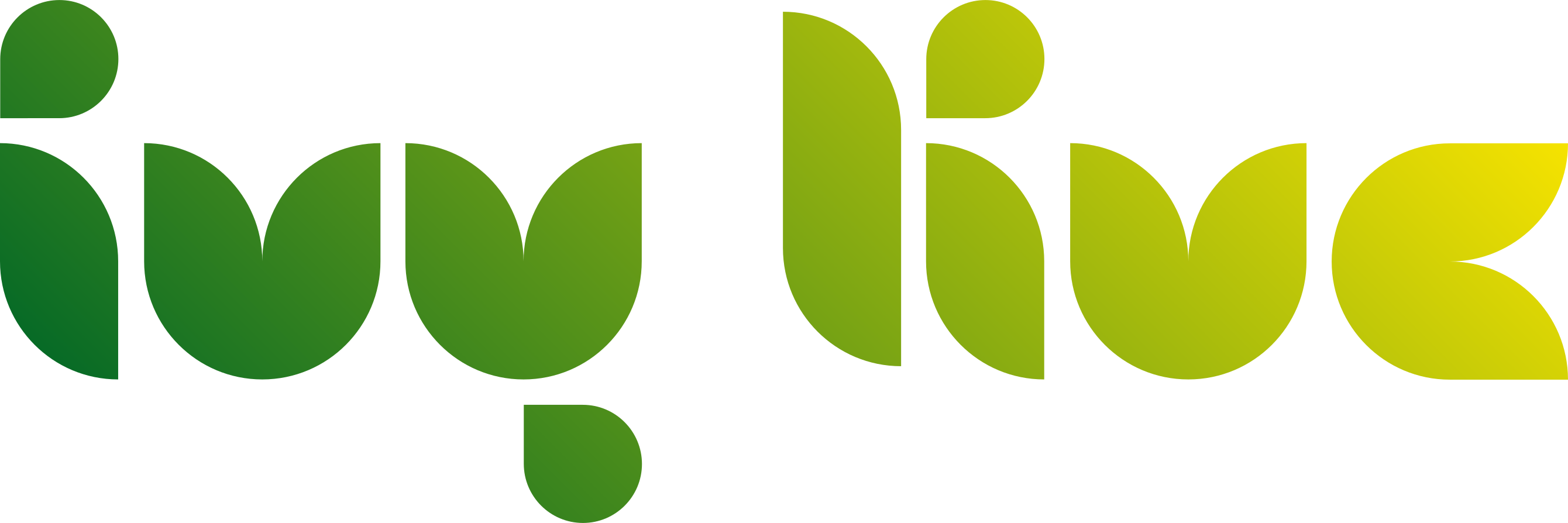
Our brand gradient flows from green (growth, nature, trust) to yellow (value, energy, light). That transition represents the journey from web2 to web3, from user to owner.
Choosing a background
The gradient logo works on both light and dark backgrounds. If the background is busy (a photo or pattern), switch to the single-color white or black variant.
Usage rules
Two rules keep the logo legible and recognizable: enough space around it, and enough scale.
x = the height of the mark. Leave at least ½x of empty space on all four sides; no other element, text or page edge should enter it.
120 px

32 px
Minimum size. Do not use the horizontal logo below 120 pixels or the mark below 32 pixels. In print, do not go below 30 mm and 8 mm respectively.
What not to do
Do not add a shadow behind the logo.
Do not add an outline to the logo.
Do not stretch or scale the logo disproportionately.
Do not rotate or skew the logo.
Do not recolor the logo.
Do not place the logo on a low-contrast background.
Using the Ivy name
- The brand name is always written as Ivy, not "IVY" or "ivy". The company name is Ivy Live.
- You may create content that refers to Ivy, but do not imply that it was produced, approved or endorsed by Ivy.
- Do not make the Ivy logo part of your own product, token or community logo, and do not combine it with another brand.
- Do not use our brand assets in misleading, unlawful or hateful contexts.
Colors
The palette is deliberately narrow: two brand colors and two neutrals. Click a card to copy the value to your clipboard.
Interface tints
Using the brand colors as-is on a dark theme lowers contrast. In the interface we use these two lightened tints; they are not brand colors, only a screen adaptation.
Typography
Ivy's entire interface and communication is set in Manrope: a geometric, warm sans-serif that stays clean across diacritics.
Ivy
ABCÇDEFGĞHIİJKLMNOÖPRSŞTUÜVYZ
abcçdefgğhıijklmnoöprsştuüvyz
0123456789
Extrabold
800 · headings, numerals
Semibold
600 · subheadings, buttons
Regular
400 · body text
Manrope is open source and free to download from Google Fonts. Where Manrope is unavailable, a system sans-serif (SF Pro, Segoe UI, Roboto) is an acceptable fallback. Google Fonts
Voice & tone
Ivy's language is plain, honest and centered on the user.
Clear and honest
We avoid hype, empty promises and crypto jargon. If something is uncertain, we say it is uncertain.
Empowering
We address the reader directly. The hero of the story is the user, not the platform.
Transparent
We state fees, rules and numbers as they are; all of them are verifiable on chain.
Assets
Logo files are available as SVG (vector, sharp at any size) and PNG (transparent, high resolution). Always prefer SVG for print and large-scale use.
Primary Logo
The mark and wordmark combined horizontally. This is the default; use it wherever you do not specifically need another variant.
Logomark
Coming soonThe ivy mark on its own. Use it where space is tight: avatars, profile images and favicons.
Wordmark
Coming soonThe lettering only. Use it where the mark already appears, to avoid repetition.
Vertical Lockup
Coming soonMark on top, wordmark below. For narrow, tall spaces and square formats.
App Icon
The mark inside a rounded square. For favicons, app icons and store listings.
Monochrome White
Coming soonFor dark or busy backgrounds, over photography, or in print where a gradient is not possible.
Monochrome Black
Coming soonFor light backgrounds, single-color print and anywhere the gradient cannot be applied.
Official accounts
This is the complete list of accounts that speak for Ivy. Any account not listed here is not ours. If you are unsure whether an account that contacted you is genuine, check it against this list. We never send the first message, and we will never ask for your seed phrase.
Press & partnerships
Write to us for special usage requests, press questions, interviews or partnerships. We will get back to you as soon as possible.